2023
industry
Social services
about the client
Te Hapori Ora (The Village of Wellbeing) is a New Zealand-based, non-profit organization, focused on community well-being. As indigenous practitioners (Māori), they provide a selection of Social Services that include: Practitioner Supervision, Counseling, Visual Coaching, Wellbeing Wānanga (like a course, programme and event all rolled up together) focusing on individual, family, and community wellbeing. We were commissioned to rebrand Te Hapori Ora, redesign their website and collateral.
the goal
The organisation have spent three years experimenting with different mediums and approaches to create a structure/service/products that works best for their organisation/community. They were also now expanding their services to other indigenous and migrant communities in New Zealand so they wanted to polish their brand identity with good branding practices.
scope
old logo
Pulling in the ideas and symbols of the old logo, we wanted to keep the same concept because of the backstory and meaning behind each element of the logo. It represented a traditional Maori art of a legend, the eagle, aka Hokioi, souring high up in the sky with its wings wide open.

the process
When one of the founders of Te Hapori Ora, Brendon Eriksen-Downs, reached out to us to do their rebranding, we were faced with a few challenges:
- preserving the origin or story of the original logo
- learning about the Māori culture
- designing a logo that will stand out and stand through time
We started with lots of sketches. Every design choice along the way wasn’t just about looking good but feeling right and true to the Māori heritage.


the new logo
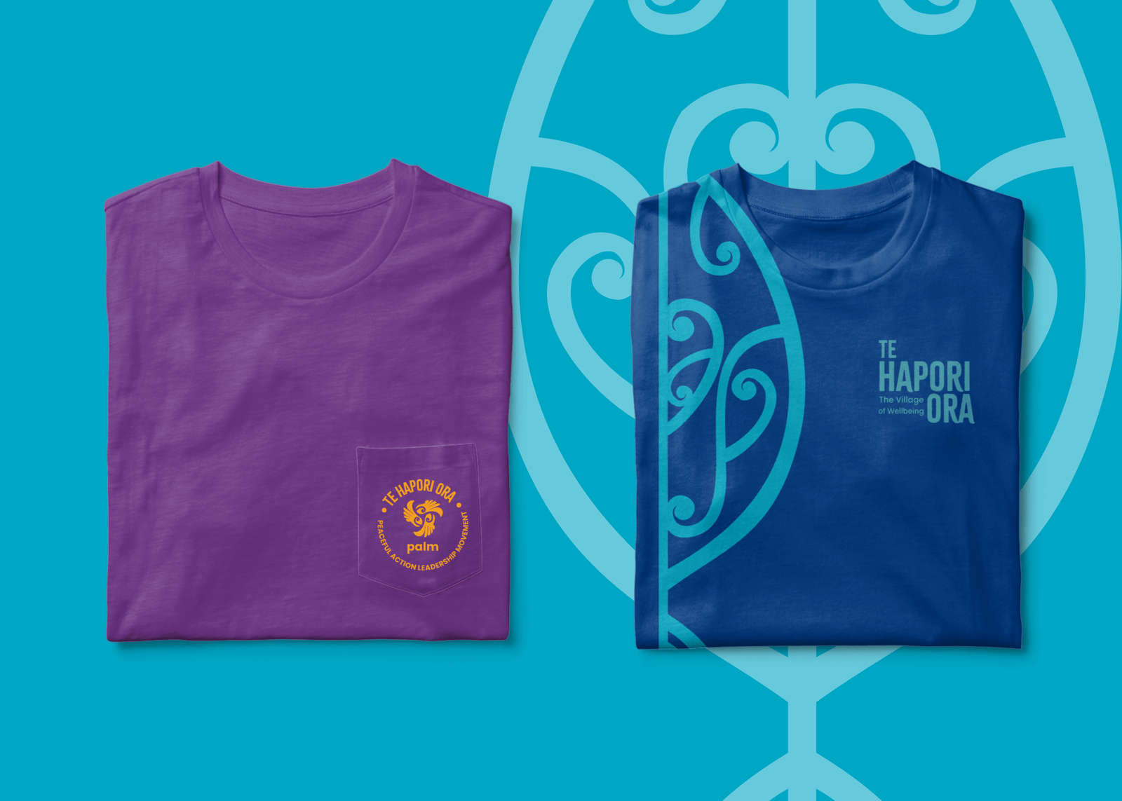
For the logo of Te Hapori Ora, we really wanted the logo to feel like a symbol of collective strength and vision. The logo still represents a Hokioi. The hands forming the wings of the Hokioi represent unity, the eagle’s watchful gaze embodies deep understanding and connection, a nod to their guiding principle of making and maintaining family relationship aka whanaungatanga.
At its heart, where the spirit of their work lies, we’ve integrated a symbol that’s all about the life force and energy that they bring to their practice of wellbeing. The wings, etched with stories of journeys and healing, symbolize where they’ve been and where they are headed, collectively.
At the core of our brand identity system we’ve created a brand pattern.The pattern is derived from the Hokioi in the logo.
Included within this design is the ‘koiri‘, a pattern that symbolizes aspects such as flourishing, self-reflection, and nurturing. These are attributes that align with their values, indicating growth, introspection, and a caring approach.


additional graphics
We also created some additional graphics that represent their programs or departments along with some icons for their website.


Explore More
Explore More
Explore More
Explore More
SEW GLORIA DESIGNS
SEW GLORIA DESIGNS
BLOOMA